
Embracing the Concept of Biophilic Design
At its core, biophilic design is all about establishing connections between people and the natural world. This idea has been gaining popularity lately with more companies realizing the importance of integrating nature into their strategies. Who doesn’t appreciate spending time in nature right?
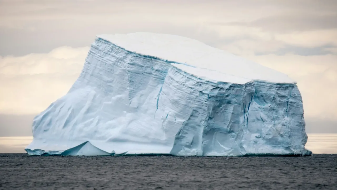
At Xerofit, we decided to plunge into the depths of glacial waters, focusing on icebergs.
Why Choose Icebergs?
An iceberg can be an excellent metaphor for a brand identity for several reasons, capturing both the visible and underlying elements that make a brand successful and impactful.
- Strength and Stability: Similar to how most of an icebergs mass lies beneath the surface a robust brand identity is rooted in core values, quality and consistency.
- Trust and Reliability: Just like an icebergs true depth becomes apparent upon examination over time showcasing authenticity and depth mirrors how a brands character evolves.
- Adaptability and Resilience: The endurance of an iceberg in challenging environments symbolizes a brand’s ability to endure hardships while staying true to its identity and principles.
Using an iceberg as symbolism for brand identity effectively communicates that there is more, to a brand than meets the eye. It underscores the significance of the elements that uphold and define the aspects showcasing the intricacy, profundity and resilience that contribute to a brands genuine success.
Capturing Nature’s Essence: Inspiring Xerofit’s Brand Identity
Step 1: Curating images from nature
At Xerofit, we drew inspiration from the serene yet powerful features of glaciers, icebergs, stalagmites, and glacial runoff.

Exploring colors in Nature for Xerofit brand
Step 2: Examining textures
Glaciers have a sharp, rugged texture compared to the smooth surrounding water. Their icy peaks and deep crevices create a striking contrast against the calm backdrop. Fresh glacier melt, with its clear, cold look, stands out vividly in the deep blue ocean, showcasing the dynamic interplay between ice and sea. This natural spectacle really highlights the raw power and beauty of our planet’s polar regions – elements we wanted to incorporate into the Xerofit brand identity.
Step 3: Selecting the dominant colors
The collection provided the perfect base palette, allowing us to ultimately arrive at our distinctive brand color: #24C4D4. This specific shade of turquoise is inspired by the serene and vibrant aspects of nature, embodying the tranquil yet powerful essence of the sea and sky. By incorporating this color, we aimed to create an identity that evokes a sense of calm, purity, and strength in our brand.
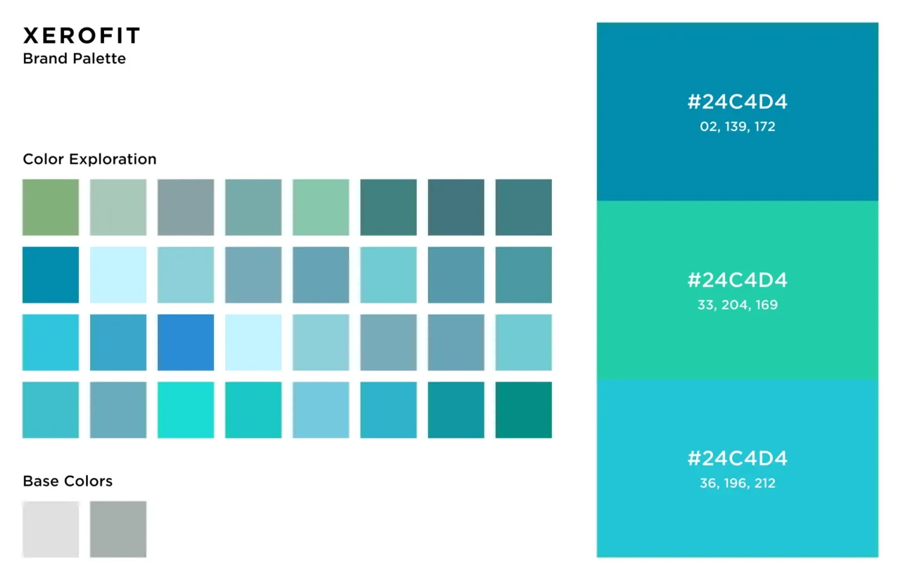
Xerofit Color Palette
Based on our research in nature, Xerofit embodies the peak of the iceberg. It simplifies complex technology in a user-friendly way, making advanced solutions accessible to everyone. Just as the glacier melt seamlessly integrates into the ocean, Xerofit seamlessly integrates innovative technology into everyday use, ensuring that even the most intricate systems are easy to navigate and understand.
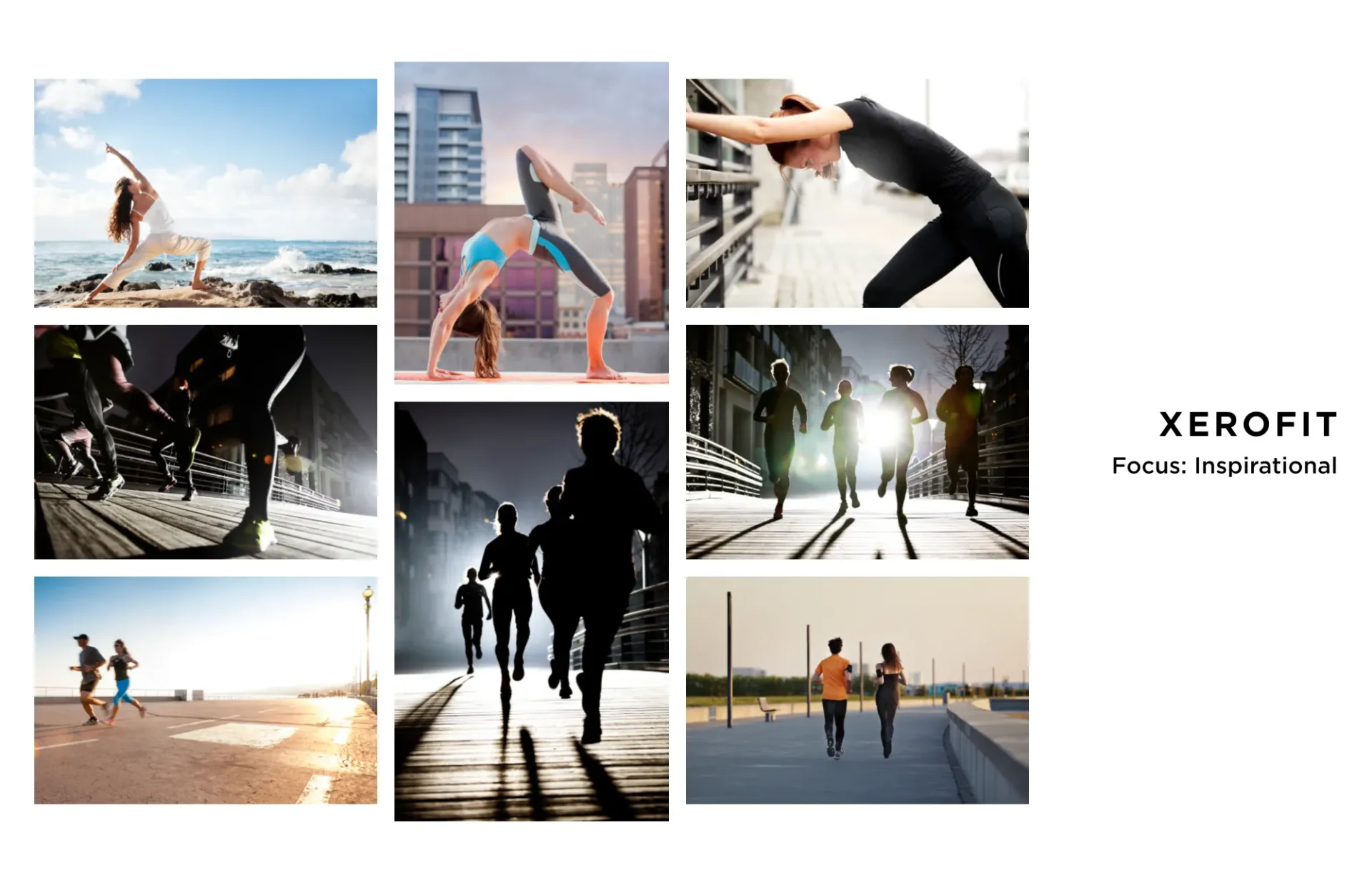
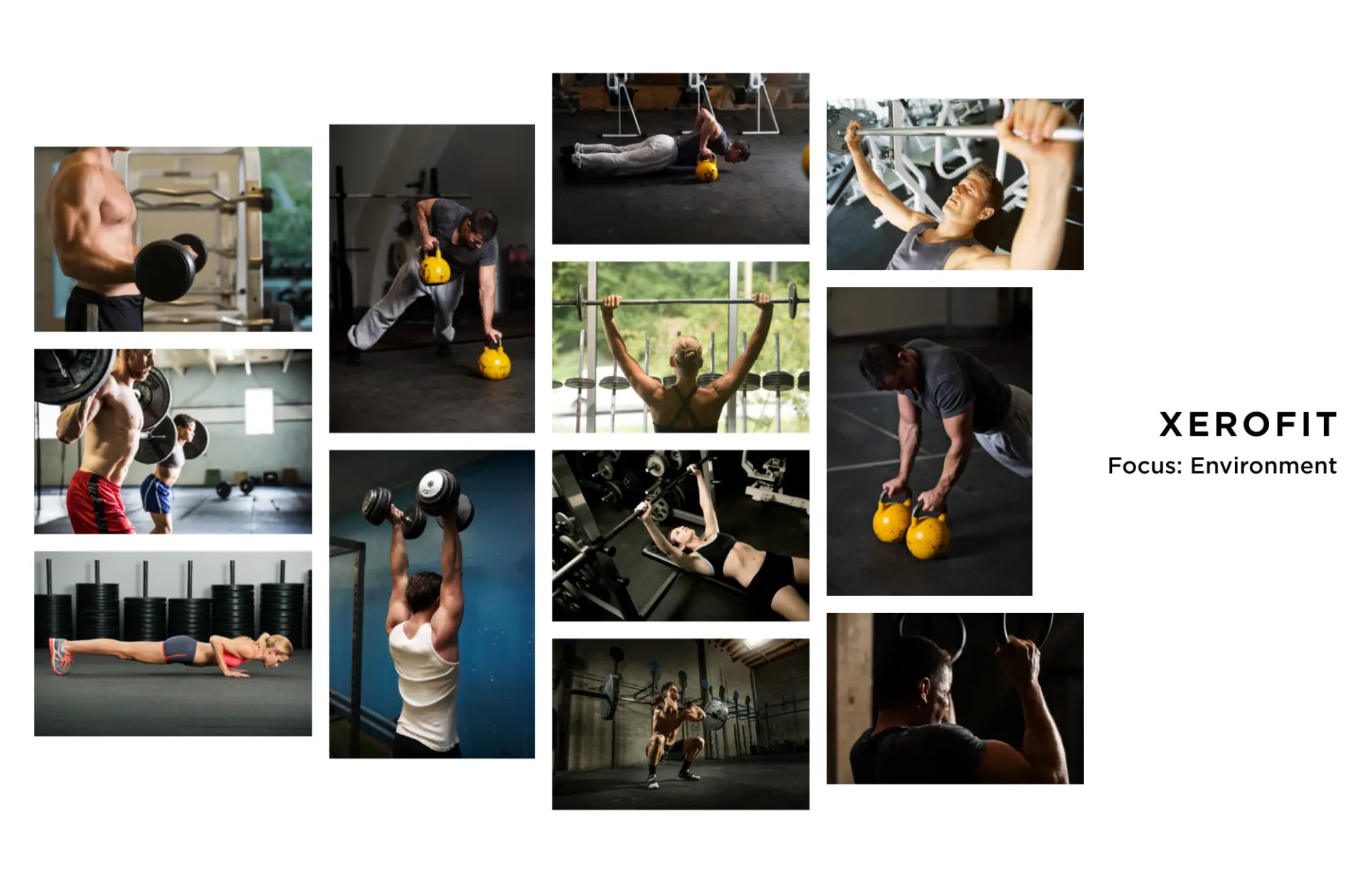
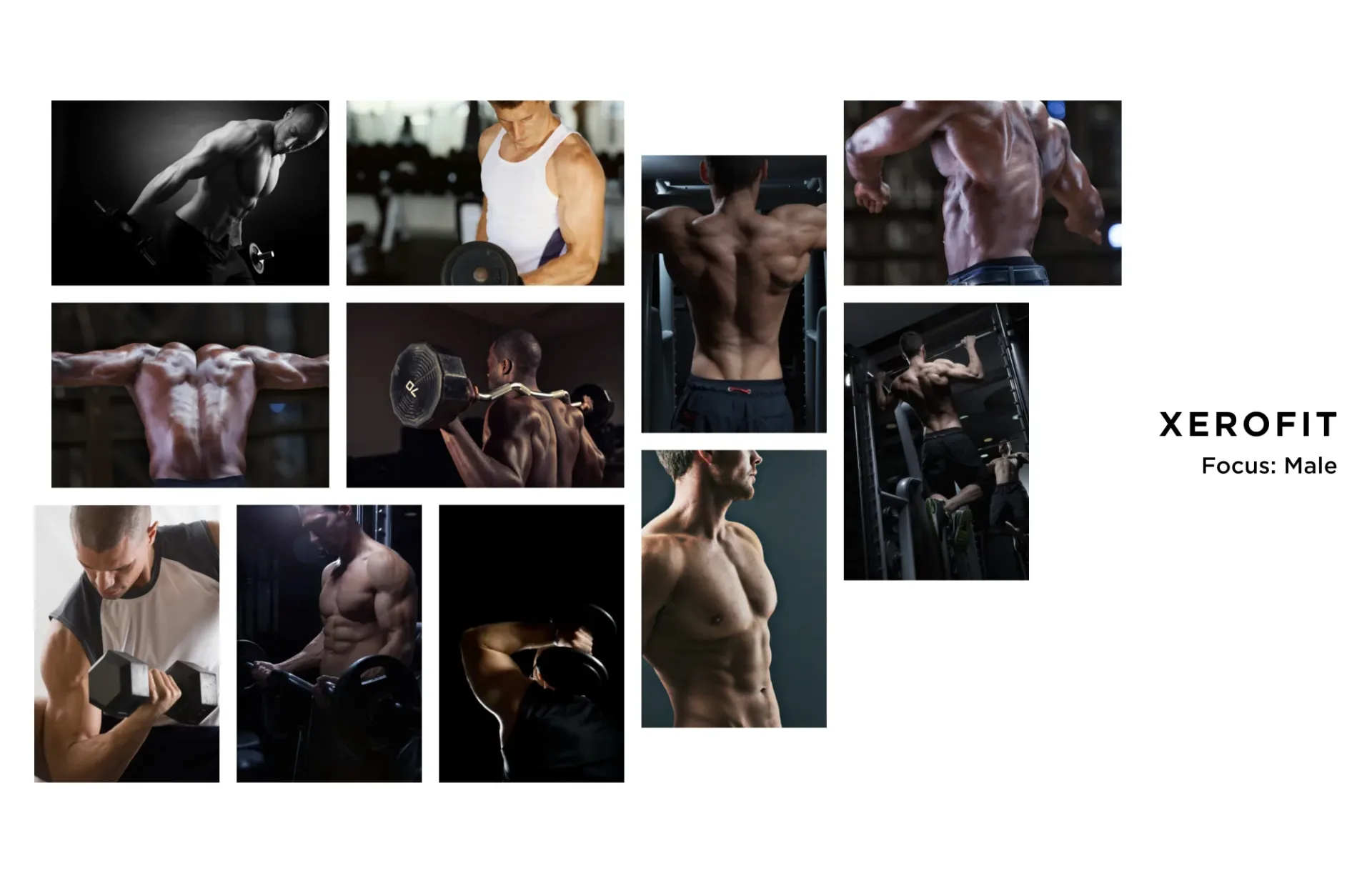
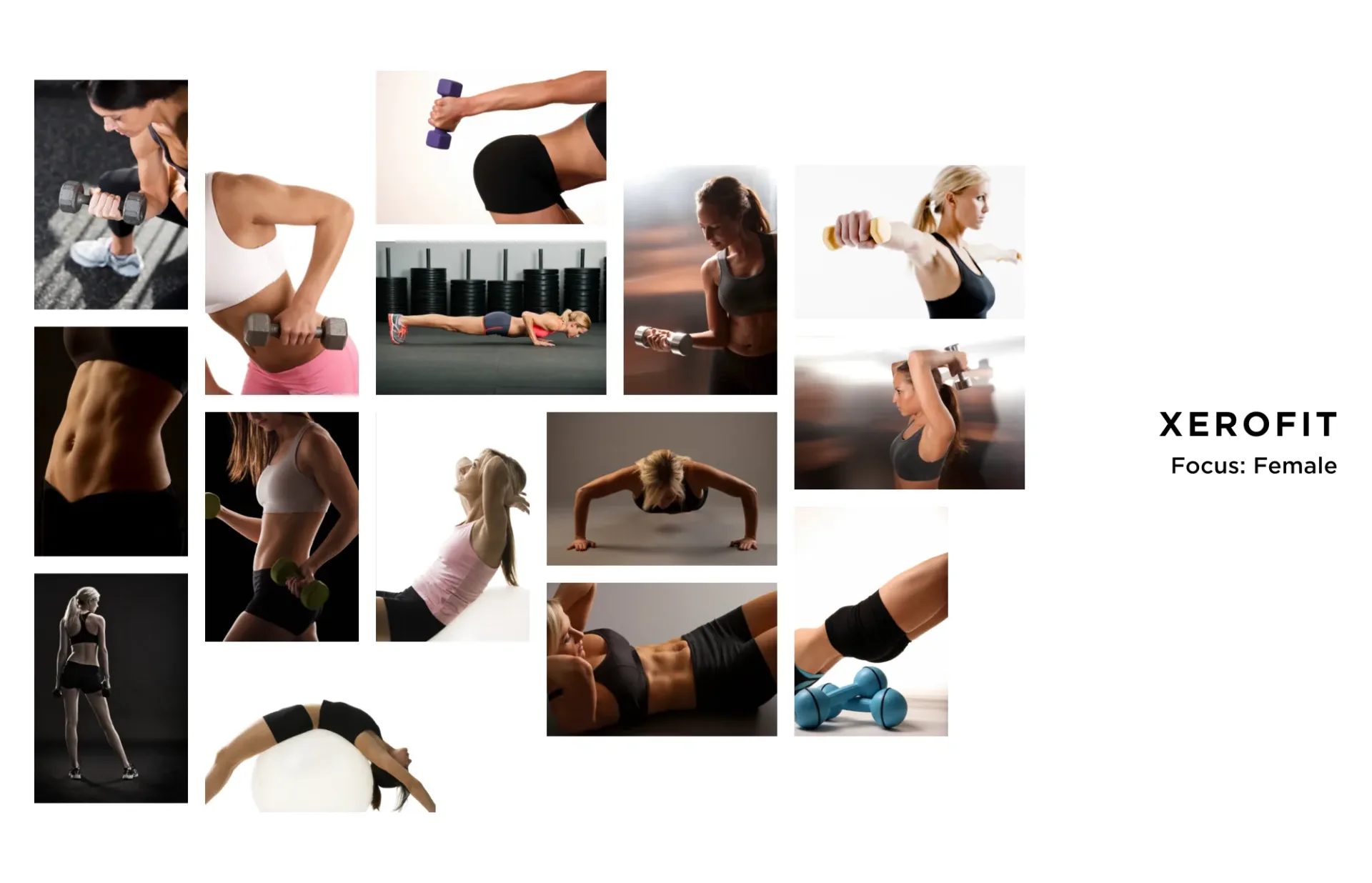
Mood Boards: Creating the Brand Energy
Mood boards are great tool for visualizing and establishing a brand’s vibe and identity. By gathering images, textures, colors, and other visual elements, mood boards give a clear picture of the aesthetic and emotional tone you’re aiming for. They also help align team members and stakeholders under a unified brand vision.
We created four distinct mood boards, each conveying specific aspects of our vision. Each of these mood boards helped us refine our brand identity and develop a consistent visual language that would resonate with our target audience.
- Inspiration – Sparking motivation for your workout
- Environment – The ambiance and setting of your workout space, such as a gym
- Female Trainers – Personal trainers dedicated to women’s fitness needs
- Male Trainers – Experts focused on addressing men’s unique fitness goals
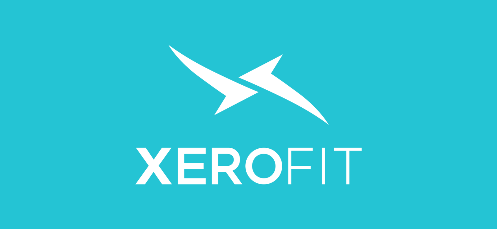
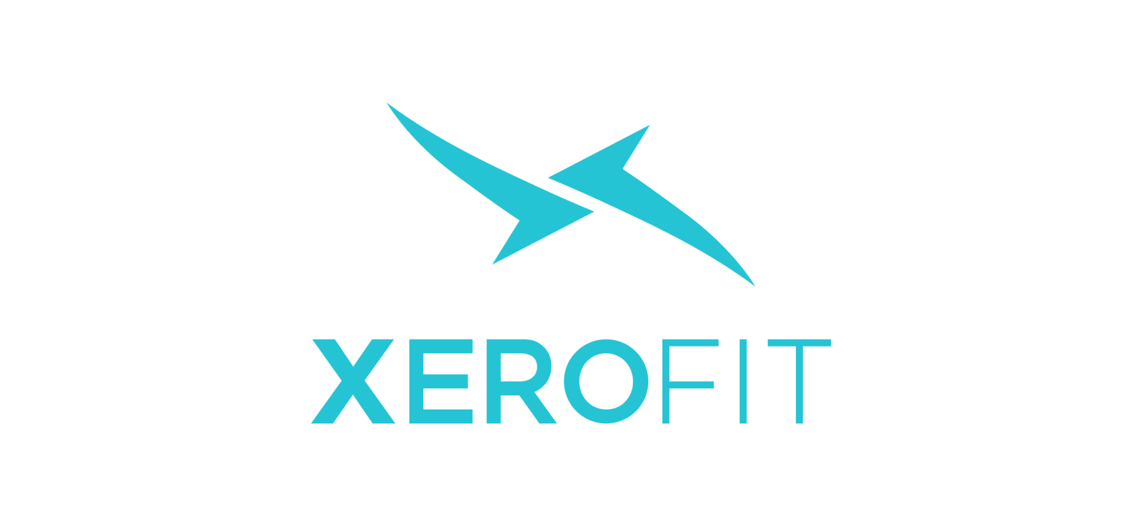
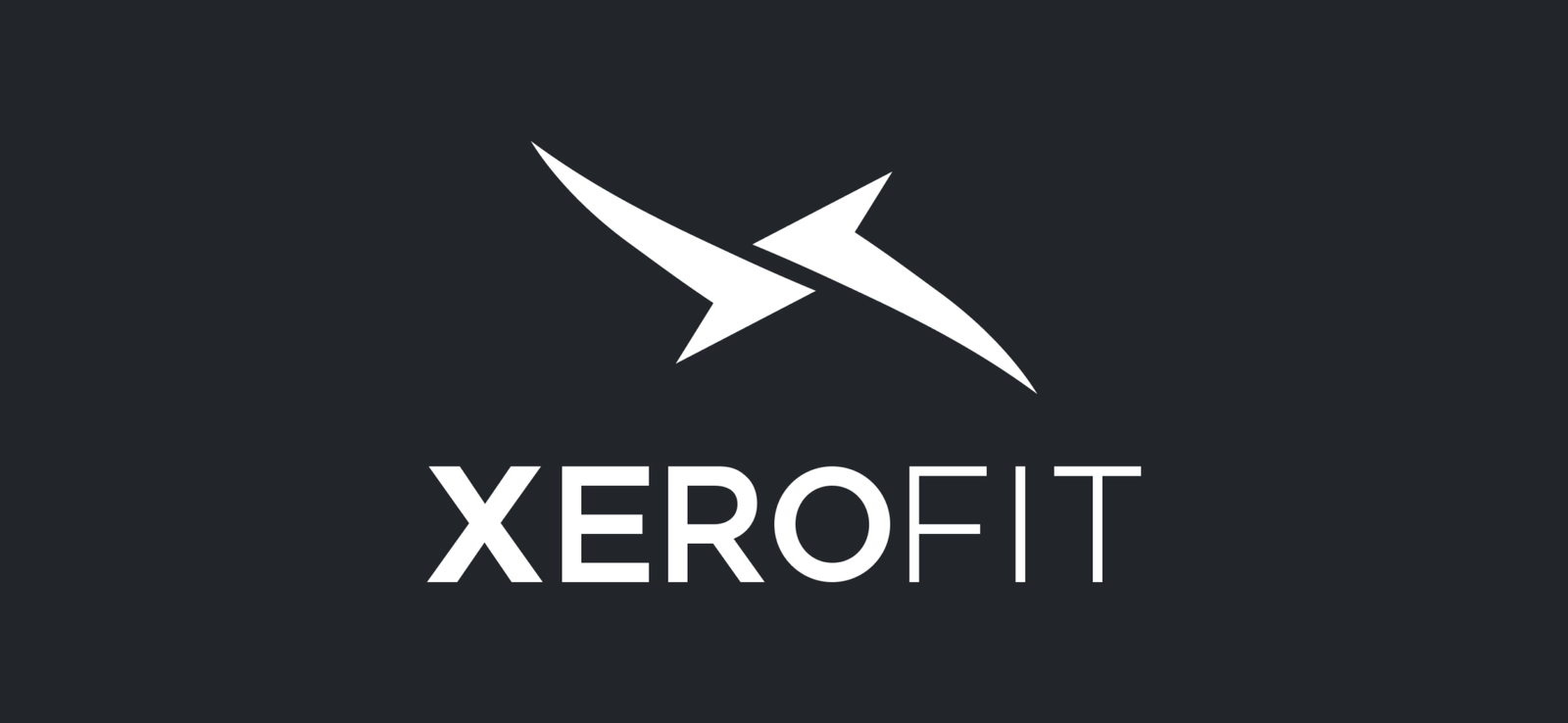
Engineering “The Blade”
The main inspiration for the Xerofit logo is twofold. First, it aims to evoke a sense of strength and stability, reminiscent of the sharp and contrasting structures of icebergs. Second is the shape of the Nike Swoosh. From these two elements, the “Xerofit Blade” was born.
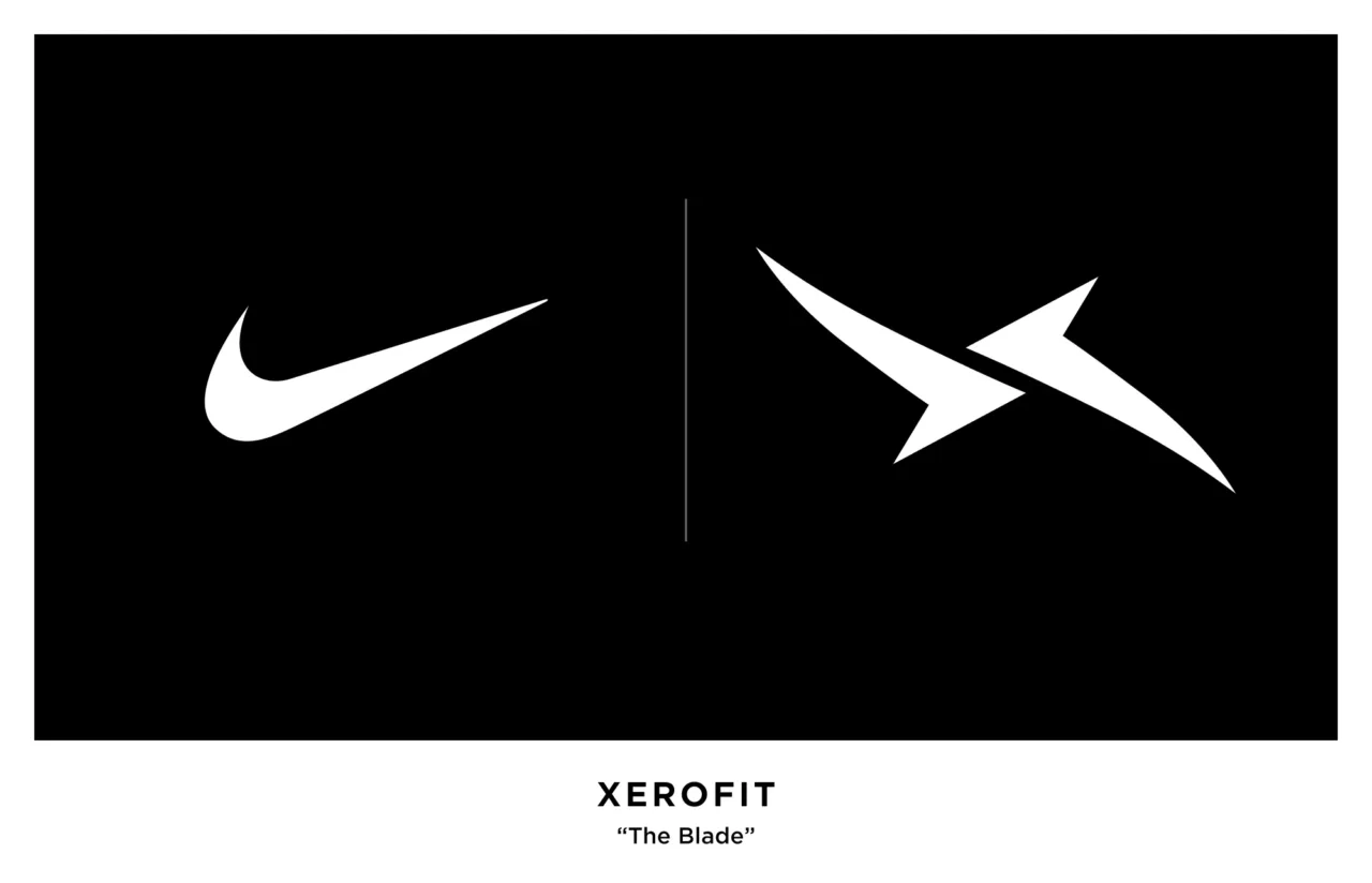
The Nike Swoosh compared to the Xerofit Blade
Typography – Setting the Tone
Picking Gotham as the primary typeface for the Xerofit brand was an easy choice. It embodies the Xerofit brand essence – strength, clarity, and simplicity.
- Modern and Clean Aesthetic – Gotham is known for its modern, clean lines and balanced proportions – A nod to Xerofit’s contemporary approach to integrating and simplifying technology in the fitness industry.
- Strength and Stability – Gotham’s bold characters reflect the stability and strength of the iceberg – reinforcing Xerofit’s commitment to reliability and resilience. A solid foundation built on quality and consistency is essential in both fitness and technology.
- Timeless Appeal – Much like the enduring nature of an iceberg, Gotham possesses a timeless quality that ensures longevity and relevance.
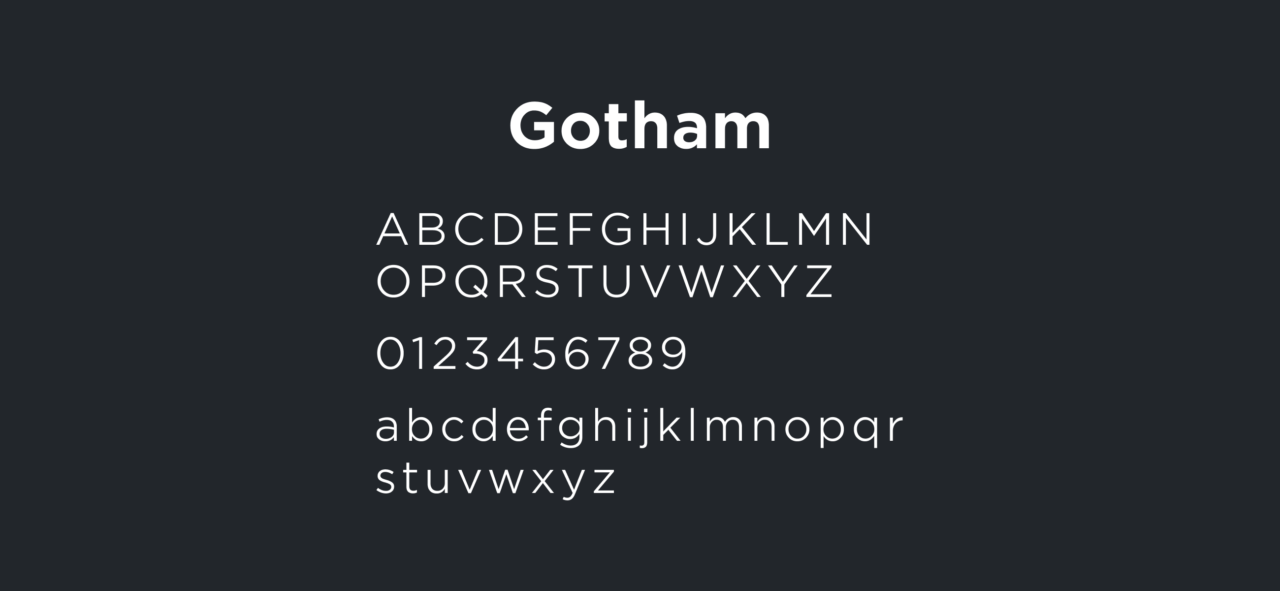
Gotham Typeface Character Set
Putting it all Together
Using Gotham alongside the “Xerofit Blade” logo, with its play on bold and thin all-uppercase letters, creates a subtle, yet memorable visual contrast. By using nature as our guide, we have created an aesthetic that is not only visually appealing but also authentic and meaningful – just like the brand itself.
Overview
Drawing inspiration from nature using biophilic design principles and mood boards to create a cohesive visual language and unified brand.
Contents
Categories
Skills
Year
2015