
Iconography – Revamping the Pin for A Fresh Look
The most noticeable change was the icons. By replacing three sharp, skinny pins with one larger round pin in the logo, we significantly simplify the iconography and reduce the design complexity. This results in a clean aesthetic and a much more versatile design (as we will explore later).
Simplifying VenueLabs Pin Icons.
Typography – Changing the Feels
Switching the typeface from Trebuchet MS to Canaro, we aimed to evoke a more modern tech-based feeling. Trebuchet MS served us well for years with its readability and classic style, but we felt it was time for an update to better align with our evolving brand identity. Canaro, with its sleek lines and contemporary aesthetic, offers a fresh look that complemented our identity and focus on innovation and bleeding-edge technology.
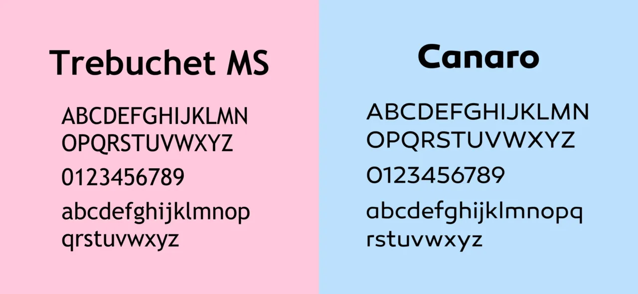
Trebuchet MS compared to Canaro
Colors – Simplifying The Palette
Its important to note that at this time in the industry we saw tech giants like Apple and Google transitioning from skeuomorphic design to flat design – emphasizing stark simplicity.
By eliminating the 3-pin design, we drastically simplify the range of colors. Not only were the three pins different colors, they also used a linear gradient introducing a much larger range of colors into the design. The multiple colors also made it more difficult to create a grayscale logo.
We simplify the VenueLabs logo to a single pin and now a single color – orange. We update the orange from a darker shade of burnt orange (#D77527) to a more lively and crisp orange (#F47715).

Venuelabs Orange Comparison
Unified Branding – Paving the Path for Future Growth
As we approached the launch of our second major product, we recognized the need for a visually unified product lineup. By simplifying the logo to a single pin, we effectively differentiated our offerings through color, while maintaining a cohesive look and feel. This strategic decision underscores our commitment to thoughtful design and problem-solving, ensuring our brand remains clear and consistent as we grow.
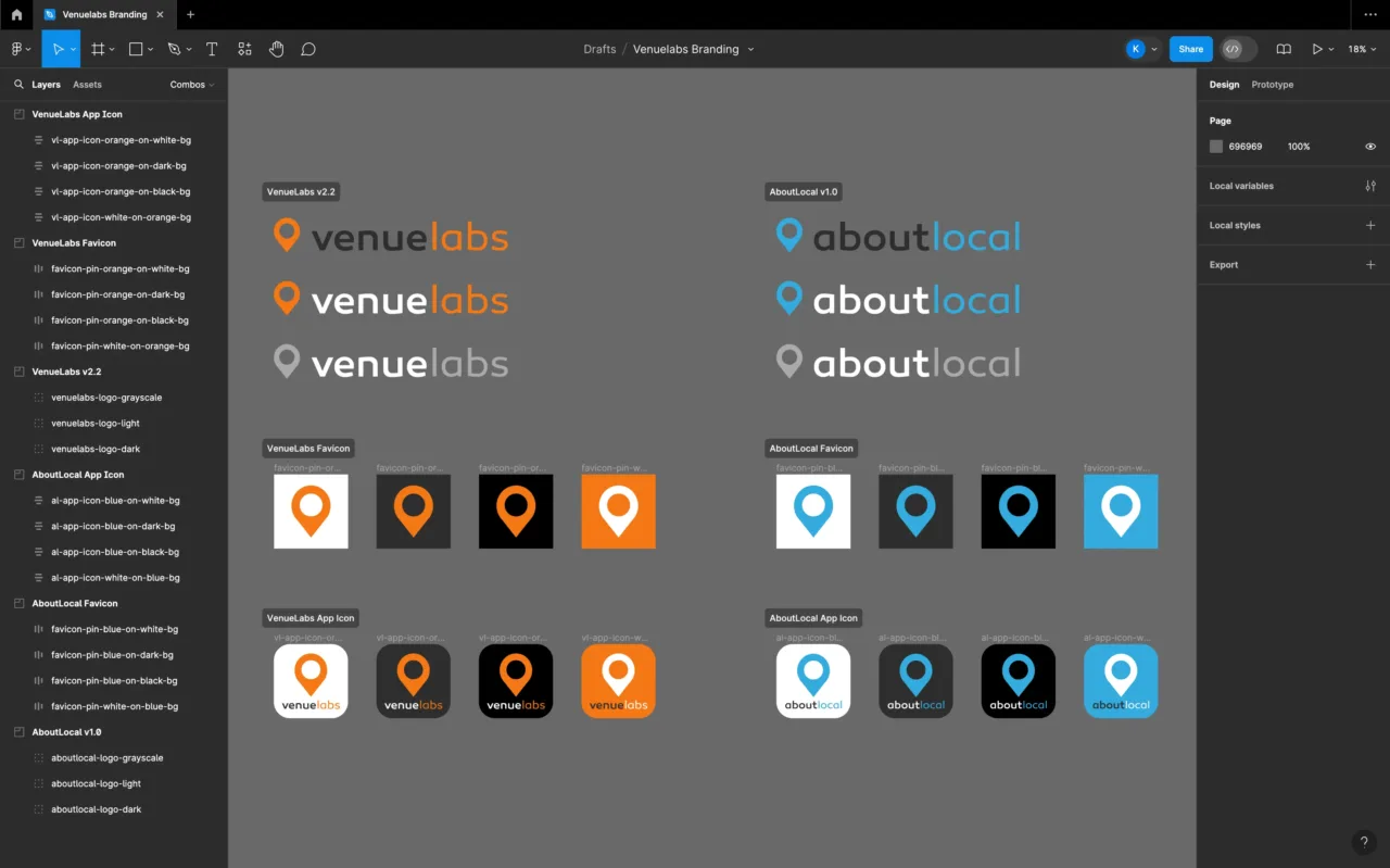
Branding Cohesion VenueLabs and AboutLocal
The Final Result
By simplifying the iconography to a single, larger pin, and updating typography to the sleek Canaro typeface, it reduced design complexity while enhancing the overall aesthetic appeal. The new, vibrant orange color not only streamlines the palette but also energizes the brand image. These thoughtful changes ensured the logo would be versatile and scalable, ready to adapt and grow with the evolving product lineup.
VenueLabs Logo Version Comparison
Overview
Transforming the Venuelabs logo with updated iconography, typography, and color palette for a modern and unified look with a cohesive brand identity.
Contents
Categories
Skills
Year
2012