Exploring The Simplicity of Negative Space
What exactly is negative space? Commonly referred to as space it represents the areas that encircle and separate the components, within a design. Essentially it is the area left void by elements.
In the logo of Greater than Consulting logo, we use negative space with the letter “T” to create the illusion that the letter is absent from the GTC. Take a look:

Highlighting the negative space in the GTC logo
Situated between the geometric curves of the letters “G” and “C,” the straight lines and sharp 90-degree angles of the “T” create a striking contrast and seamless visual harmony. This minimalist design reflects GTC’s mission to optimize enterprise software testing and delivery with precision and clarity.
Classic Blue – A Tried and True
Blue evokes feelings of trust, reliability, and security. It is frequently associated with calmness and peace, making it a popular choice for healthcare, financial, and technology companies. Numerous surveys have shown that blue ranks as the most popular color in the world. This data specifically, reveals that 57% of men and 35% of women consider blue their favorite color, making it an effective choice for branding.

Choosing the Perfect GTC Blue
For Greater than Consulting, the color #2424DC combines the calming and trustworthy qualities of blue with a bright, energetic tone and a hint of purple to evoke a sense of elegance and sophistication.
Typeface – The Timeless Gotham
For the logo and text we go with a battle-tested classic – Gotham. The clean lines of Gotham are complemented by its geometric proportions and slightly condensed letterforms, giving the logo a sense of balance and stability. One of my personal favorites, Gotham portrays strength, modernity, and professionalism – making it a great fit for Greater than Consulting.

Gotham typeface characters
Result – A Simple Logo with a Powerful Message
The initial impression of the GTC logo is simple and clear aligning with our intention of emphasizing clarity and simplicity. It represents the companys dedication, to precision, efficiency and openness in their software testing offerings. Incorporating negative space and opting for a bold, blocky font we create a striking visual representation is crafted for the Greater than Consulting brand.

Greater than Consulting Master Figma Design File
One Component to Rule them All
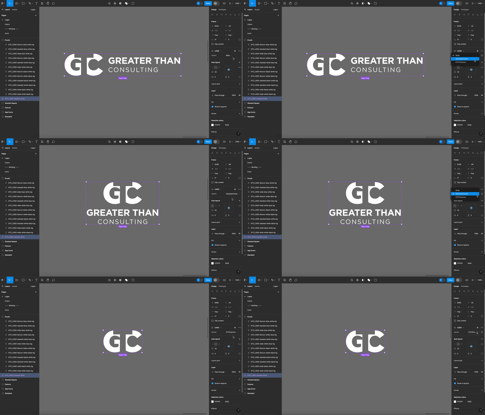
In my Figma design files, I often use components to make the design process smoother. By setting up a “Parent Component,” all the copies, or “Children,” automatically get its properties. This way, any change we make to the parent is instantly updated in all the children. For the GTC logo, we created a component with a variant property, so we can easily switch between the three versions of the logo:
- Wide – Your standard landcape look with favicon to the left
- Stacked – Aspect ratio closer to 1, with the favicon on top
- Favicon – No text, just “GTC” icon

GTC dynamic logo component in Figma
A Final Glance
Maybe consider using negative space in your own designs to convey a strong message in a simple way. Try experimenting with space – you might come up with something amazing! Sometimes remember that simplicity can be more impactful. Have fun designing!

Greater than Consulting Logo Stack
Overview
Merging a simple design with the timeless Gotham typeface to reflect Greater than Consulting's values of precision, efficiency, and clarity in enterprise software testing.
Contents
Categories
Skills
Year
2024
